Table of contents
- Padding
- Border & Margin
- Height and Width
- Box-sizing : borderbox
- Display type : inline vs block
- Different types of displays applied to HTML elements which have outerdisplay type block
- Different types of displays applied to HTML elements which have outerdisplay type in-line
- How to handle different displays (Desktop vs Mobile)
- CSS Box Model
- The standard CSS box model
- The alternative CSS box model
- Inheriting box-sizing
- Example : Borderbox vs Content box
- Margin collapsing
- Box types
- Display : Block
- Display : inline
- Display : inline-block
Padding
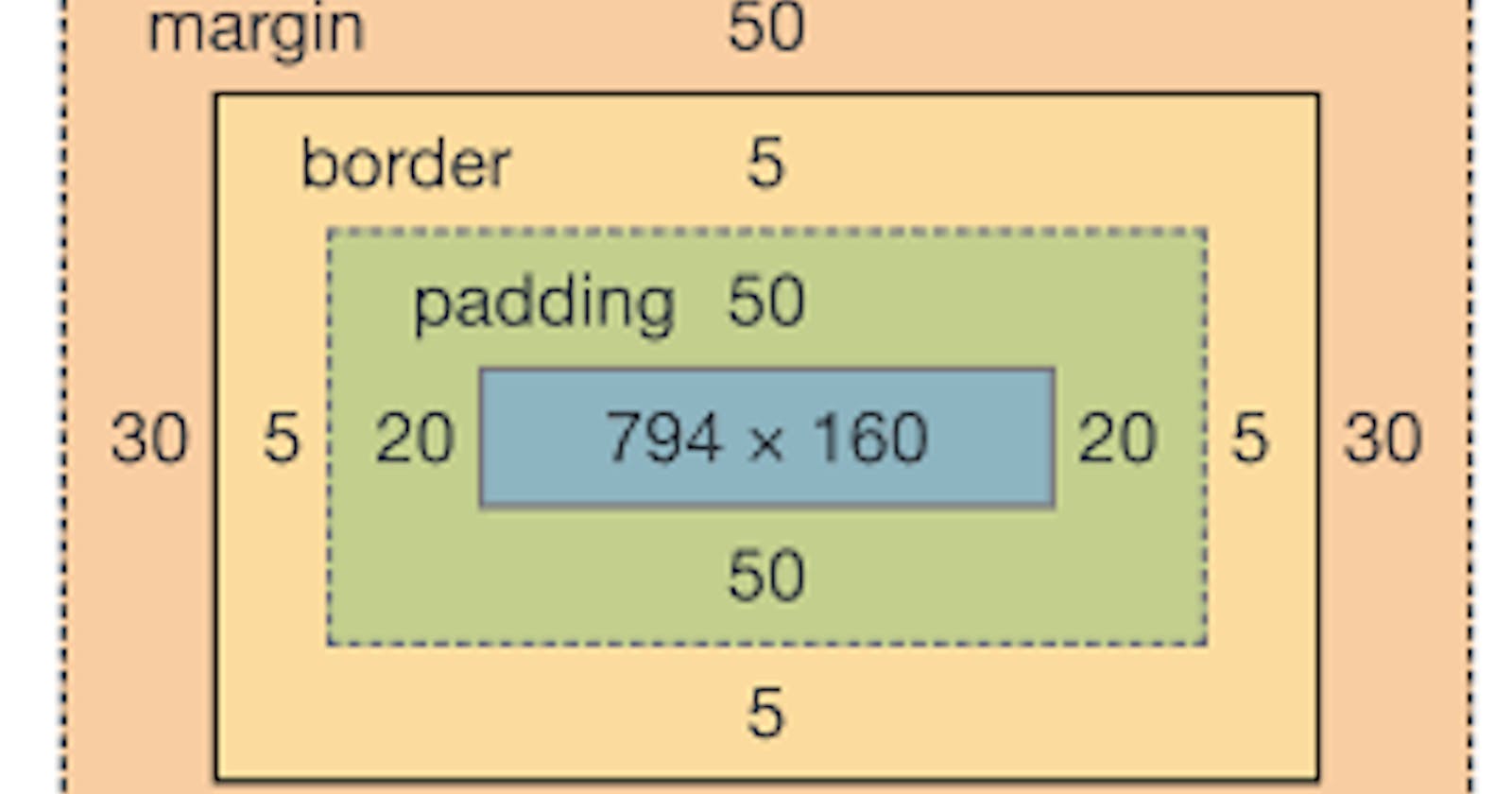
Padding creates extra space within an element. In contrast, margin creates extra space around an element.
Border & Margin
Height and Width
Height and width specify content size
Total Height of Element: Height + Padding + border
Box-sizing : borderbox
To force Height of element is equal to height property then use
box-sizing: border-box
Display type : inline vs block
Different types of displays applied to HTML elements which have outerdisplay type block
Different types of displays applied to HTML elements which have outerdisplay type in-line
How to handle different displays (Desktop vs Mobile)
To toggle between the display modes, you can change
display: inlinetodisplay: blockordisplay: inline-flextodisplay: flex.
CSS Box Model

The standard CSS box model
The actual space taken up by the box will be
Total width: 410px (350 + 25 + 25 + 5 + 5) (width + padding + border)
Total height: 210px high (150 + 25 + 25 + 5 + 5). (height + padding + border)
.box {
  width: 350px;
  height: 150px;
  margin: 10px;
  padding: 25px;
  border: 5px solid black;
}
Note: The margin is not counted towards the actual size of the box — sure, it affects the total space that the box will take up on the page, but only the space outside the box. The box's area stops at the border — it does not extend into the margin.
The alternative CSS box model
To turn on the alternative model for an element, set box-sizing: border-box on it:
Total Width : 350 px (Only Width parameter, content area = width-padding-border)
Total Height : 350 px (Only Width parameter, content area = width-padding-border)
.box {
  width: 350px;
  inline-size: 350px;
  height: 150px;
  block-size: 150px;
  margin: 10px;
  padding: 25px;
  border: 5px solid black;
}
To use the alternative box model for all of your elements (which is a common choice among developers), set the box-sizing property on the <html> element and set all other elements to inherit that value:
html {
  box-sizing: border-box;
}
*,
*::before,
*::after {
  box-sizing: inherit;
}
The ::before and ::after pseudo-elements enable you to insert content into the document using CSS.
Below is scenario if we don't inherit
.component {
  /* designed to work in default box-sizing */
  /* in your page, you could reset it to normal */
  box-sizing: content-box;
}
* {
  box-sizing: border-box;
}
<div class="component"> <!-- I'm content-box -->
  <header> <!-- I'm border-box still -->
  </header>
</div>
In order to make that reset easier and more intuitive, you can use the inheriting snippet up at the top there, and the inheriting will be preserved.
Inheriting box-sizing
Example : Borderbox vs Content box
Margin collapsing
Depending on whether two elements whose margins touch have positive or negative margins, the results will be different:
Two positive margins will combine to become one margin. Its size will be equal to the largest individual margin.
Two negative margins will collapse and the smallest (furthest from zero) value will be used.
If one margin is negative, its value will be subtracted from the total.
Box types
Boxes : Block & Inline
Boxes display type : inner display type & outer display type
Display : Block
display : block
The box will break onto a new line.
The width and height properties are respected.
Padding, margin and border will cause other elements to be pushed away from the box.
If width is not specified, the box will extend in the inline direction to fill the space available in its container. In most cases, the box will become as wide as its container, filling up 100% of the space available.
Ex: H1, P
Display : inline
display: inlineThe box will not break onto a new line.
Top and bottom padding, margins, and borders will apply but will not cause other inline boxes to move away from the box.
Left and right padding, margins, and borders will apply and will cause other inline boxes to move away from the box.
Some HTML elements, such as <a>, <span>, <em> and <strong> use inline as their outer display type by default.
Display : inline-block
display: inline-block is a special value of display, which provides a middle ground between inline and block. Use it if you do not want an item to break onto a new line, but do want it to respect width and height and avoid the overlapping seen above.
An element with display: inline-block does a subset of the block things we already know about:
The width and height properties are respected.
padding, margin, and border will cause other elements to be pushed away from the box.
It does not, however, break onto a new line, and will only become larger than its content if you explicitly add width and height properties.
